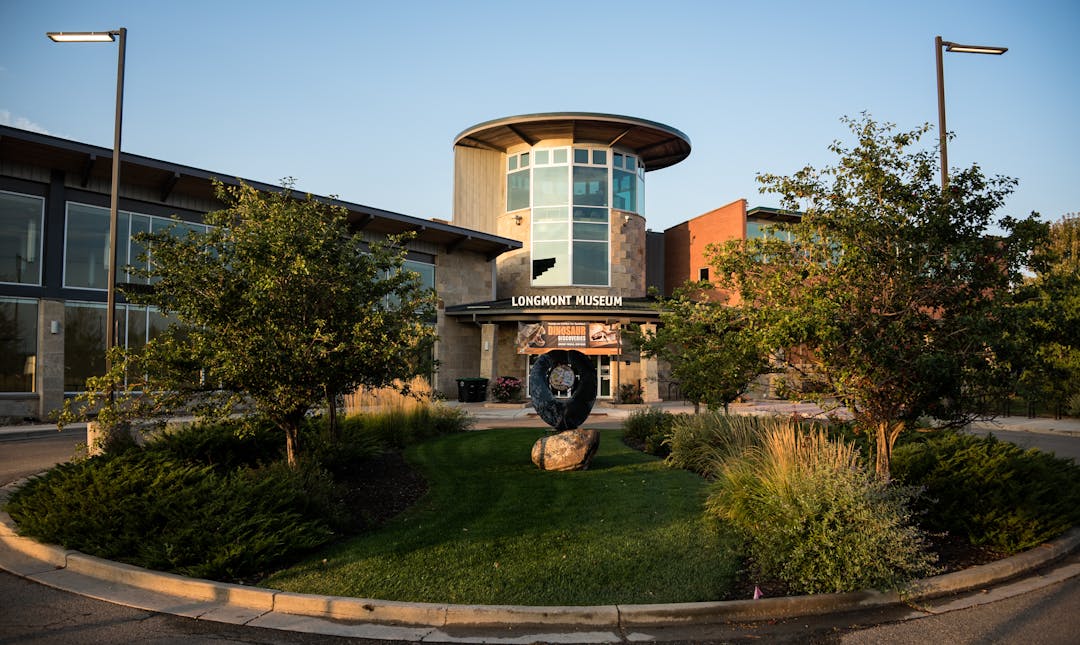
Longmont Museum Master Plan
Consultation has concluded

Hello! Thank you for your interest in the future of the Longmont Museum!
We are collecting this information as part of the master development plan for the Museum. Please keep in mind that the drawings below are high level concepts to better understand needs and space. They are not intended as final designs and will continue to evolve.
- First, take a look at the three different floor plans of the Museum, as well as the three different concepts for the entire property. Make sure to write down which one impressed you the most!
- Second, share your thoughts in the survey tab below!
Thank you for your input!
-
Concept A - Floor Plan & Site Plan
Share Concept A - Floor Plan & Site Plan on Facebook Share Concept A - Floor Plan & Site Plan on Twitter Share Concept A - Floor Plan & Site Plan on Linkedin Email Concept A - Floor Plan & Site Plan linkCLOSED: This discussion has concluded.
Click on the green title to view more information about Concept A floor plan and site plan.
See below for the proposed floor plan Longmont Museum building and the site plan for Concept A. Make sure to take notes on what you liked about it and why.
Floor Plan (Concept A)
NOTE: Click on the images to view the floor plan and/or the site plan as a PDF in a separate tab.
This floor plan includes children's and flex galleries, an additional auditorium space and lobby/reception area, as well as a new exterior facade.
Benefits:
- Entry on west side for important solar exposure
- Vestibule with proper airlock for better temperature control
- Larger lobby space for pre-assembly
- Cafe space and seating area
- Flexible gallery 90-degree corner cuts off viewing of performance pavilion
- Added universal restrooms
- New and larger gift shop
- Staff workshop centered between galleries with good access
- West-facing loading dock and south-facing backstage with improved truck loading
Trade-offs:
- More parking required to accommodate auditorium
- Building footprint size reduces amount of parking space
- Distance between the two auditoriums
- Flexible gallery 90-degree corner cut-offs of viewing of performance pavilion
Site Plan (Concept A)
 NOTE: Click photo to view a PDF of this site plan in a separate tab.
This site plan concept includes interactive gardens, a medicinal/edible garden, a themed playground, a performance stage, along with flex spaces.
Benefits:
- Entry experience into site
- Three access points
- Flex space options for medicinal/edible gardens or themed play area
- Flex space for emergency, vendor and loading needs
- Strong connections to north and west properties, as well as the Recreation Center and surrounding trails/greenways
Trade-offs:
- Lack of parking toward the east side (additional parking is needed)
- Gallery addition encroaches into events/gathering space
-
Concept B - Floor Plan & Site Plan
Share Concept B - Floor Plan & Site Plan on Facebook Share Concept B - Floor Plan & Site Plan on Twitter Share Concept B - Floor Plan & Site Plan on Linkedin Email Concept B - Floor Plan & Site Plan linkCLOSED: This discussion has concluded.
Click on the green title to view more information about Concept B floor plan and site plan.
See below for the proposed floor plan Longmont Museum building and the site plan for Concept B. Make sure to take notes on what you liked about it and why.
Floor Plan (Concept B)
 NOTE: Click on the image to view the floor plan as a PDF in a separate tab.
This floor plan includes a children's classroom, gathering space, a bigger lobby/reception area, a flex gallery space and an upgraded exterior facade.
Benefits:
- West-facing entry with improved solar exposure
- Social gathering and pre-assembly space
- Elevated stair seating area with projection screen for presentations
- Larger gift shop with good sight lines to front desk
- West-facing loading area
- Opportunity to add on performance space or more gallery space in the future
- Loading/workshop area with adjacencies to new gallery spaces
- New cafe space
- Improved/direct circulation to classrooms
Trade-offs:
- Increased footprint will require more parking and site is limited on parking spaces
- Corner of flex gallery interferes with sight lines to performance pavilion
Site Plan (Concept B)
 NOTE: Click photo to view a PDF of this site plan in a separate tab.
This site plan concept includes interactive gardens, a kids zone, a performance stage, along with flex space and gardens.
Benefits:
- Entry experience into site
- Flex space options for medicinal/edible gardens or themed play area
- Flex space for emergency, vendor and loading needs
- Strong connections to north and west properties, as well as the Recreation Center and surrounding trails/greenways
- Efficient parking and circulation
Trade-offs:
- Lack of parking toward the east side (additional parking is needed)
- Gallery addition encroaches into events/gathering space
-
Concept C - Floor Plan & Site Plan
Share Concept C - Floor Plan & Site Plan on Facebook Share Concept C - Floor Plan & Site Plan on Twitter Share Concept C - Floor Plan & Site Plan on Linkedin Email Concept C - Floor Plan & Site Plan linkCLOSED: This discussion has concluded.
Click on the green title to view more information about Concept C floor plan and site plan.
See below for the proposed floor plan Longmont Museum building and the site plan for Concept C. Make sure to take notes on what you liked about it and why.
Floor Plan (Concept C)
 NOTE: Click on the image to view the floor plan as a PDF in a separate tab.
This floor plan concept includes a children's gallery, an additional auditorium and lobby/reception area, as well as an exterior facade. A flex gallery and cafe is also added.
Benefits:
- West-facing entry with solar exposure
- Vestibule for improved temperature control
- Atrium connection/adjacency
- Outdoor plaza with connection to auditoriums/adjacency
- New children's gallery and support spaces
- Additional Flexible Gallery
- Gallery angle improves sight lines to outdoor performance space
- New cafe and gift shop
- Loading/staff workshop areas with adjacencies to galleries
- Mechanical equipment located on roofs
- Additional 500-seat auditorium
- Additional restrooms with new universal restrooms
Trade-offs:
- North-facing backstage access
- Additional parking required
Site Plan (Concept C)
 NOTE: Click photo to view a PDF of this site plan in a separate tab.
This site plan concept includes interactive gardens, a kids zone, two performance stages, along with a colorful garden.
Benefits:
- Entry experience into site
- Smaller spaces for medicinal/edible gardens or themed play areas
- Flex space for emergency, vendor and loading needs
- Adequate connections to north and west properties
Trade-offs:
- Smaller plaza/gathering space
- Front of house/back of house are adjacent to each other on the north (conflicts with "Entry Experience")
- Lack of parking toward the northeast part of property
- Gathering spaces are not as connected
Who's Listening
Level of Engagement

- Inform: Give information to the community
- Consult: Obtain feedback from the community
Learn more about the City of Longmont's Levels of Community Involvement.


